Thursday, April 18, 2024

Children photography


Sally Mann photography is challenging the audience. Her artistic children photography is enigmatic and controversial. '' Described by Time magazine as “America's greatest photographer,” she first came to international prominence in 1992 with “Immediate Family,” a series of complex and enigmatic pictures of her own children. This work, and the controversy that followed it, was chronicled in Steven Cantor’s award-winning short film, Blood Ties.'' (What Remains: The Life and Work of Sally Mann :: Zeitgeist Films, no date)
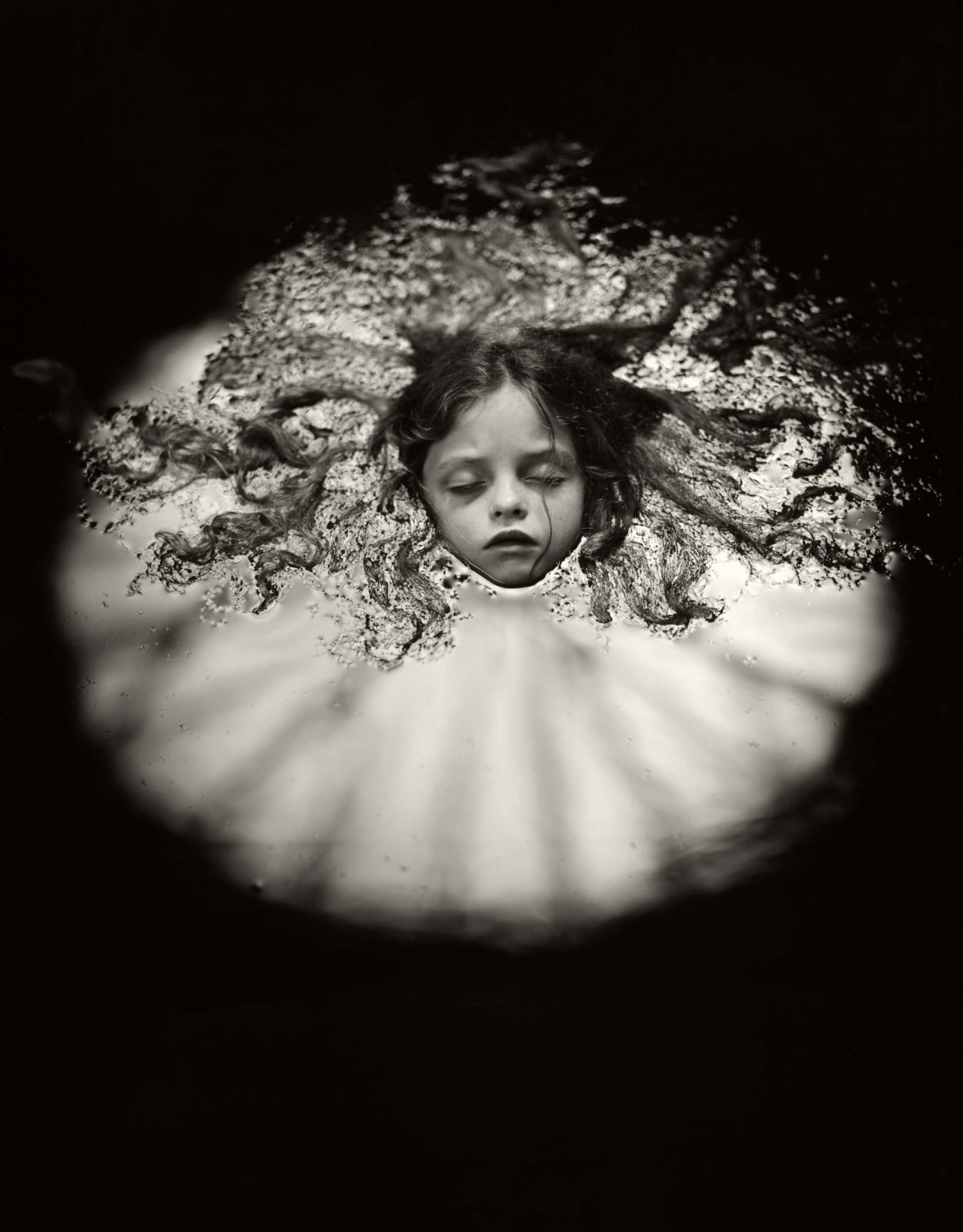
                                           Sally Mann photograph At Warm Springs with daughter Virginia in dark water with hair floating around her

                                                      sally-mann-at-warm-springs-1991/ 


Trying to reflect on this photograph important is to look for depth in it as for the first glance it looks scary and creepy. Knowing that children are vulnerable the black and white image it makes more dramatic that it might be. The image make me feel in certain way, maybe worrying if she is okay. She looks peaceful but also as she was drawning. It a direct picture focused on the girl. The background is well contrasted, black and white but strongly contrasted. The photograph could be used in horror movies. I believe Mann wanted to challenge the society norm and perception in her photography.

I have looked some of the photography are interesting but most provoking and children photography in that way is not exactly what I want to show in my project but I found a nice image and I really like the photo above. Furthermore, might consider of taking some similar shots to the above.


Then I looked at Jane Goodrich children photography for the contrast. She has a regular, everyday children, family photos but also interesting facts about capturing kids portraits outside. She clearly and shortly explain what is important in settings. The importance of tree points of exposure triangle: the aperture, shutter speed and ISO (Goodrich, 2016). Kids photography is challenging as for the fact that they cannot keep still to wait for the perfect shoot. That is why there are different aspects to look at when it comes to children's shots. Exposure compensation is often ignored but has a huge impact when it comes to children portraits and ISO for example is not something to focus much outside of youngsters portraits (Ibid).

                                       kid's outdoor photography

                          janegoodrichphotography 2016/08/Larchmont-Family-Photography

In this photograph I can see a good connection between the photographer and the children. The direct image and a mid shot tells us what relation is between the kids, having fun, holding hands, maybe on holiday as we can see from the background. The tree in beetween could be a symbol of growth and nature beauty of the childhood.


References:

(2024) Janegoodrichphotography.com. Available at: https://janegoodrichphotography.com/wp-content/webp-express/webp-images/uploads/2016/08/Larchmont-Family-Photography-1024x683.jpg.webp (Accessed: 11 March 2024).

Sally Mann, At Warm Springs, 1991 (no date) Edwynn Houk Gallery. Available at: https://www.houkgallery.com/exhibitions/2007-sally-mann-immediate-family/works/artworks-58707-sally-mann-at-warm-springs-1991/ (Accessed: 11 March 2024).
What Remains: The Life and Work of Sally Mann :: Zeitgeist Films (no date) zeitgeistfilms.com. Available at: https://zeitgeistfilms.com/film/whatremains.

Wednesday, April 17, 2024

Diane Arbus: Photographer and image


Diane Arbus (1923-1971) was well known as a controversial Photographer in America. People described her in many different ways such as Artist, Freak, Creep, Hunter. She has died by suicide at age 48. She has been recognised after death. Arbus was one of the individuals who wanted to show the vulnerability, reality and darkness in her photographs. She has been one of this people who will shoot anywhere in any kind of environmental context. She was called "the Photographer of freaks" (Davis, 2013). Arbus was iconic and fearless. In children's photography she has not only shoot the children themselves but also the atmosphere and surroundings to give the meaning to the photographs. She had a great eye for details and composition offering the viewers of more understanding and in depth to see the moments created at the time. 


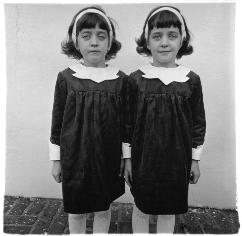
                                      Diane Arbus - Identical Twins, Roselle, New Jersey, 1967

                                            Diane Arbus – Identical Twins, Roselle, New Jersey, 1967


"There are, and have been, and will be an infinite number of things on Earth: Individuals all different, all wanting different things, all knowing different things, all loving different things, all looking different… . That is what I love: the differentness." (Diane Arbus’ iconic Twins photo - What is the story behind it?, 2019)

The idea of the Identical Twins photography was to form it in a way that for the first glance it seems to be  a regular photo but when comes to see in more depth you can see the eyes and the face expression one of the girls happy and the other looked sad. There is emotions and perception that this art brings to people once you study the photographs. The Identical twins were most popular photograph and inspired other people to be open to individuality and differences in photography. It is interesting how she has shown character and nature through one single photograph.

The photograph of Identical Twins shot in non set up way was very interesting. She captured the tension and the character differences of the two girls. The photographs mostly shows more than you see. It was one of Arbus favourites one.

Through her photographs I can see a lot of pain and not only because she has died by suicide but the expression of her photography through the details she has shown and she has put herself in many different and weird location trying to capture the perfect and realistic, non set up shots. That is what I value in Photography when is captured naturally and can tell the story within a time and her work certainly did. That is what I am looking for in my photographs. Story which I do not need to explain but is told through the image. 

In the photograph 'Identical Twins' of Diane Arbus I can see the photo done directly as she did not want to intimidate the girls as it she was levelled up and took the right approach to have unwrapped image (Arbus, 2019) I can see the intimate moments as it was taken in a mid close shot to interest the viewer . The girls are right in the centre and the composition of the photo is having dramatic background but its purpose seems to be muted to focus on the twins. On that photograph I can see one of the girls being comfortable with the shot and other who was is not. They clearly communicating that through the image. This image could be good for documentary images or the charity adverts because of the expression of emotion and the background.


References:

Faris-Belt, A. (2012) The elements of photography : understanding and creating sophisticated images. Waltham, Mass.: Focal Press.

Diane Arbus’ iconic Twins photo - What is the story behind it? (2019) Public Delivery. Available at: https://publicdelivery.org/diane-arbus-twins/.

Fearless and Iconic: 6 Tips to Emulate Diane Arbus’s Photography (no date) www.youtube.com. Available at: https://www.youtube.com/watch?v=879pShnmHWw (Accessed: 17 April 2024).

Mac Austin, H. (2010) Diane Arbus | Jewish Women’s Archive, Jwa.org. Available at: https://jwa.org/encyclopedia/article/arbus-diane.


Davis, L.J. (2013) The Disability Studies Reader, Google Books. Routledge. Abingdon: Routledge

Monday, March 11, 2024

Reflection


This term was interesting journey of self-discovery and artistic creation. Photography was always a part of my interest and it was important to learn the settings, composition and to know more about lightning. Practice in studio and with the class around the campus had a huge impact on understanding and also extremely helpful was the possibility to lend the camera to exercise at home. Continuing blog in Creative Media supported me to be more organised and set the priorities. There is still space for improvement but I have gain a lot of new knowledge. Furthermore knowledge and effective critical thinking is crucial to success. It is helping to think outside of the box and see things from others perspective.

Skills that I gain in Creative Media could not only help in professional career but are usefull in life. They helped me to understand that I enjoy drawing, when before I never thought that is possible and I could possible draw anything. Photography practices, especially black&white that I always found it more interesting than colours, gave me potential ideas for the future. Furthermore, Creative writing was a great challenge of all but eventually I found it fascinating. It is incredible how far we can go when we push our boundaries.

My website has some more projects now and I have reorganised it and I am pleased the way it looks now. I have changed the buttons and when added photography project and chapbook changed the leyout to make sure everything is joyful and the navigator operates well. Important part was also to check the mobile view as this needed a small corrections but as the most used in todays world large number of people operates the mobiles so it had to be clear and easy to navigate.

I am looking forward to a new term, the last one before the real University world and see how I can
challenge myself more in every step of the way. Next term we will be using videos instead of blog. That should be interesting.

Tuesday, March 5, 2024

Website Gallery: Book Project

 Today we are uploading our book to Wix and I will be embedding on my website. Again going to Menu and added  new page and then I moved under my Portfolio. First I have added image to my Portfolio going to Add element, Image and uploaded my cover of the book. 


I went to Canva, uploaded my book. Then on the right top of the site I went to Share, then Embed, copied the HTML and went back to Wix then Menu, Add element, pressed embed code, choose HTML code and paste in. Next I will write the Introduction to give the reason to want to read my book.


Next I went to Menu choose paragraph. I made sure I used the same font 'Gloock' as everywhere else and written introduction.

I added button to my project and changed the text to 'back to Portfolio', placed under the introduction to my book.


Then I checked how how it looks on mobile phone and everything works well and if make sense for people to see and if is easy to navigate. 


The same I have done to my Portfolio, added book and the button to move to my project. I like the way it looks and all button works well. All seems easy to navigate and presented clear to read or watch.


Monday, March 4, 2024

Website Gallery: Photographic Gallery

 First I checked my copyright if is up to date and I have changed to 2024


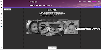
Then I wanted to add new page and again I went to Menu added new page, renamed as the name of my photographic project 'Reflection' and moved underneath my Portfolio.


Next I added the title of my Project going to menu and adding heading changed to 'Reflection' using Gloock font and 20pts using centre align.

I have changed my background to black color. Then I went to menu and add paragraph and started to write introduction to my photographic project.


Next I added button and again by going to Manu then button, chosen the design, changed text in the box and linked to my Portfolio.


Then I went to menu, gallery and chose the 3D carousel gallery where I uploaded my best shots of my Project and added in correct order to have a good idea of my photoshoot. Next I named each photograph in my album.


This week I will also be embedding my book Project to my Portfolio. I might be updating some details on my previous Project but for now that is how I will leave. I will add my last Project and see if all works well.


Tuesday, February 20, 2024

The final book: Behind You

 After all this effort, writing, rewriting, proofreading, designing my work finally book is ready but this is only a small story, just a beginning and I hope to continue in the future with writing. That book has just three chapters but I am hoping with the effort I have put into you can enjoy reading the chapbook.


                                                                            Behind You


I have shared from Canva and embedded to my website.

Monday, February 19, 2024

Process Of Making flipbook: Canva

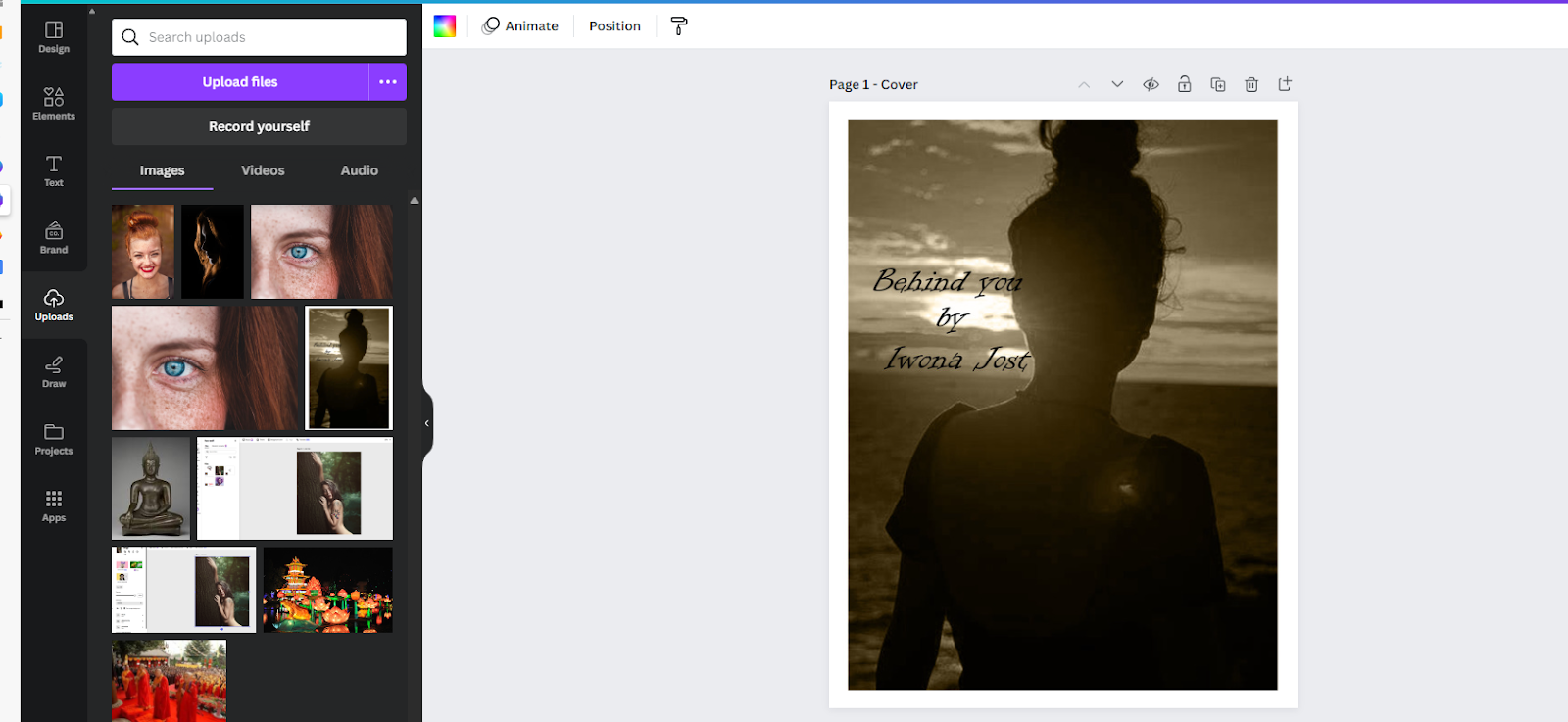
After completed some chapters of my book I created book in Canva. I have chose A4 format of magazine, choose one of the examples of the magazines and have delated all the content and start creating my chapbook. I started by downloading a cover that I created earlier. 


Next I started to add blank pages to my book and by going to Menu I add a heading and I have put my title and my name to the next page. 


Following another page I started with adding heading then again going to Menu and add Text I have include a Quote and another text contain my chapter. This is not finished yet so it might change once I look at it deeply. 


Then I have moved the quote to separate page and rename my chapter. I have downloaded the image from Unsplash and added to my book by going to Menu add image and under the photo add in text content of my book.


Children photography

Sally Mann photography is challenging the audience. Her artistic children photography is enigmatic and controversial. '' Described b...